
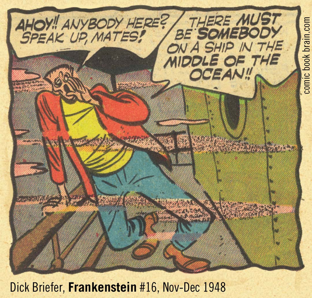
Comic Book Coloring on Newsprint
About Newsprint Comics
In the Facebook bio Backderf writes "...in Tatjana's time, floppy comics were printed on shitty newsprint. The printing was garbage. The color resolution was low..."
I don't want to directly rebut Backderf's statements, afterall it's just the lead up to praising Tatjana Wood's work, work which is quite worthy of praise.
Comic Book Coloring
Rather, I want to address the corollary: how the distance of time, along with a misplaced self-assurance born of 21st-century printing and digital technologies (and perhaps the spirit of the age itself), leads many people to spurn the look of old newsprint comic books. But how many 21st-century “recolored” reprints of those books are actually inferior to the original “shitty” newsprint versions? Too many.
In reprints on high-quality paper, the black lines are firmer and crisper, and the color laydown is perfectly flat, free from the chronic out-of-registration problems of old gravure presses. Yet this technically superior application often makes the final images of reprinted comics appear flatter and less alive than before.
All too often, those crisp black lines are not derived from scans of original artwork, but from digitally filtered scans of printed newsprint pages, where the color is stripped away and the remaining black ink is then digitally "improved." In the process, defects from the original printing are amplified, pushing the reprinted image even further from the original line work drawn by the artist.
Then there is the older method: reprints derived from the Greg Theakston process, in which color was chemically removed from printed comic pages to isolate the black line art. That art was then photographed on a PMT/stat camera (20th century) or scanned (21st century) and treated as "original art" for recoloring, with the new colors simply mimicking the placement of the old ones. Like many modern digital approaches, this method ignores a crucial fact: the original colorists understood how ink would behave on the paper.
They knew how much ink the paper would absorb. They anticipated dot gain, the way those iconic, tiny halftone dots would spread once printed. They compensated accordingly, sometimes laying in heavier color because they knew the cheap paper would absorb a portion of it. These were not accidents; they were informed production decisions.
Herein lies the contradiction: modern digital printing is superior in nearly every way, but only when used properly. When it isn’t, the result is, for modern comic books, too often over-colored work with a chaotic palette that obscures the line art. In reprints of older, pre-digital comic art, the problem is compounded by misunderstanding: the coarseness of the old printing is now grotesquely exaggerated, while the finer line work is distorted or lost entirely.
How often have you looked at a new reprint of an old comic and realized the original “shitty” newsprint version is actually more subtle, and, in effect, better? How often have you struggled to read a modern comic because the digital color is too dense, too dark, or so visually busy that it diminishes the underlying drawing, making the original artwork’s subtleties very hard to discern?
In the end, superior tools lose their superiority when used poorly. Reprinting old newsprint comics is not automatically improved by the use of 21st-century technology. The challenge of remaking these works, whether to improve them or at the least to maintain them, is a very real hurdle. Too often, that hurdle is ignored, out of a failure to understand what was actually achieved originally on newsprint.
March 26, 2026
You will see Amazon links on this web site because I am an Amazon affiliate. I earn from qualifying purchases.


Original Page March 26, 2026 | Updated April 21, 2026